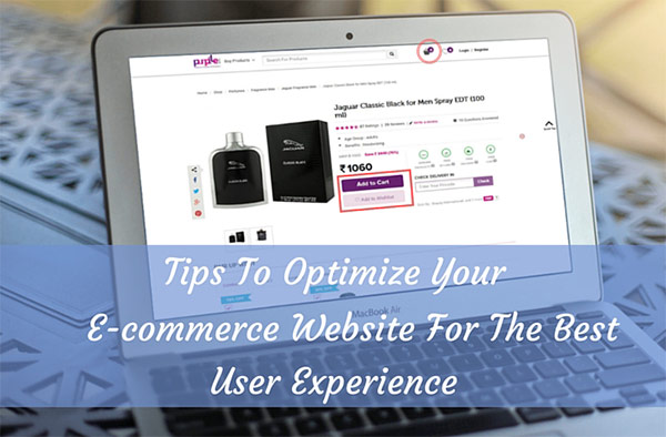
In a time when eCommerce is rocking the business world sending whirlwind of revenues your way, you can’t possible not satisfy that God. Every business in today’s time has an eCommerce portal, but frankly that is not sufficient. An off-putting user-friendly eCommerce website will divert traffic to other competitor sites faster than the blink of an eye and there is little you can do to undo that.
Luckily, this article offers a briefing on the top 5 usability tips that can empower your eCommerce into a live sales station that is on fire all year round.
So, how exactly to get there? Here are some secrets shared by eCommerce Web Development gurus who have tactically immersed themselves into studying this platform for years now.
Recognition Should Spark at the Very First Contact
The Ecommerce website should be expressive enough to give away who you are and what you have for the visitors without a conscious effort made to read through the lines. No wordy content please, for the website. It’s boring and standoffish.
Your website should simply spell out what you have in offer and a good few reasons why the visitor should use your site among millions of others. Though this is not cakewalk, managing to spark up a recognition can ensure enough visual engagement to table the rest of the persuasion.
Guide the Search
The products should not hide themselves behind the plumes of the design. Of all things, what you have to offer to the people should be in plain sight. If you have an expansive catalogue, then guide them through with a user-friendly search system.
They may feel lazy to look actively, and the duty is yours to route them in the shortest and easiest way possible. One way of engaging the choosy customers is filters. The more your website has them, the closer you are to finding them just what they want.
And of course, there should be a compare view by which customers can tally and gauge two or more products before picking one.
Curated Bundles
Your visitor might have stepped into your portal looking for something, but that actually presents you the opportunity to sell them more than just that one item, and it’s all on the presentation.
Curated collections is a great way of initiating purchase of a bundle of products instead of loosies. Hampers and kits also make great gift items.
Oblique Selling Pressure
There is absolutely no negative connotation to that strategy on either end. It is just a way of triggering the purchasing decision by means of profitable deals and offers.
If you are promoting a new product, add a promotional offer.If you are selling out older products that have partly lost the market, introduce some incredible deals.
If you are selling a service, tag in a guarantee coverage. Of course, you need to punch in an expiration date to all the offers to rush the visitors and prevent procrastination.
Straight Purchase Process
You need to greet the visitors with an outstanding collection of products and thank them for choosing your site with a simplistic purchase process. It should not be cryptic, which is to say the process should not need any figuring out. A complicated eCommerce experience is the first thing that shoos off buyers.
You can offer your visitors the best eCommerce experience through some very simple features.
First thing, allow them to shop as guests whereby registration is not mandated.From selecting the product to placing order, the number of steps should be as few as possible.
The cart should have a constant access. It should have ease of addition and removal of products.So, when you design your eCommerce portal, make sure these points are attended to for complete optimization and great user experience of the website to increase your leads & conversions.


