Responsive Web Design Services
Beautifully designed responsive websites, optimised to web, mobile and tablets.
WHTL is providing Responsive Website Design services to clients across the globe. Responsive web design is a feature which makes the web pages viewable in variable screen sizes. The technology is creating ease for us all and internet can be used anywhere anytime on tablets and smartphones. Thus, the websites must be made in a format that can be easily displayed and viewed over them. To understand it more easily, we can say that responsive websites response to the environment and devices they are being viewed at.
How WHTL serves as the Best Responsive Web Design Company?
In a responsive web design, the web pages work with a fundamental shift, by which the web pages adjust themselves according to the screen size of the device.
Today, everyone is switching to the responsive web design. The responsive website design is not difficult but just requires some different steps to be followed. A responsive website is super flexible for viewing on all browsing devices such as computers, tablets and mobile phones. Rather than having different websites for different devices, having one responsive website is way easier and cost effective. Plus, it reduces the effort to manage the website. Only one responsive website design will come up to the standards of all. Our Responsive web design services can help your business flourish as your website will be easily accessible to all the customers on all the devices.
RESPOSIVE WEBSITE DESIGN SERVICES
Responsive web design is recommended by Google for all websites as it will give same URL and HTML for a website. Google highly recommends the websites to have Responsive web design due to its importance in SEO as well. Additionally, Google prefers responsive web design because content that lives on one website and one URL is much easier for users to share, interact with, and link to than content that lives on a separate mobile site. If you will have a separate desktop and mobile site, you will require separate SEO campaigns. Managing one site and one SEO campaign is far easier than managing two sites and two SEO campaigns. This is a key advantage a responsive website has over a separate mobile site.
Why Choose WHTL for Responsive Web Design?
Expertise in Responsive Design: At WHTL, we specialize in creating responsive websites that adapt seamlessly to various screen sizes and devices. Our team of skilled designers and developers ensures your website looks and functions flawlessly across desktops, laptops, tablets, and smartphones.
User-Centric Approach: We prioritize user experience in our responsive design process, focusing on intuitive navigation, fast load times, and engaging visuals to keep visitors engaged and satisfied.
Customized Solutions: Every project is unique, and we tailor our responsive web design services to meet your specific needs and goals, ensuring a truly personalized experience.
Proven Track Record: With a portfolio of successful projects and satisfied clients, WHTL is your trusted partner for responsive web design. Choose us for a website that not only looks great but also performs exceptionally across all devices.

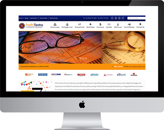
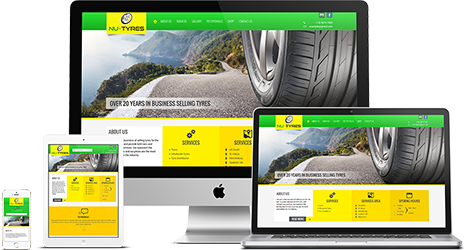
EXPLORE OUR RESPONSIVE WEB DESIGN PROJECTS
Have a glimpse to the range of awesome Responsive Website Design
projects delivered by us.